
Written by: Emma Prushan, VCD, ’25
During their fall semester, juniors in the Visual Communication Design Program take Introduction to Branding, a course that begins with a detailed study of brand and brand identity, and culminates in the development of an integrated branding system. A high degree of conceptual, aesthetic and technical ability is considered in three projects beginning with a rebrand of a local organization, followed by the branding of a fictitious culinary experience, and ending with creating a new brand for a business in the wellness, music, or toy industry.
“External factors — from economic to cultural, environmental and political — are affecting people more than ever before, making life more complicated and purchasing decisions more multi-faceted,” said Baiju Shah, chief strategy officer, Accenture Song. “There is a growing divide between what consumers need and value and what businesses offer, creating a relevance gap. We believe that companies can bridge this gap and herald significant growth by not focusing on promoting consumption, but in meaningfully contributing to customers’ lives.”
For this project, students were assigned to concept and design an identity, with multiple brand touchpoints, for a wellness, music, or toy industry of your choice. Working in groups, students researched the current market, defined their company, researched and defined an audience, wrote a mission statement, named the company, and collected visual inspiration. Once the company has been conceptualized and defined, students individually developed a full identity system.
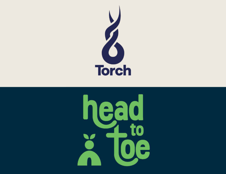
Joelle Klouda ‘25 – Torch
Joelle Klouda (Visual Communication Design ‘25) was part of the group who created Torch in response to safety in the music entertainment industry. Torch is an organization providing safety and security from sexual assault primarily at music festivals and concerts. Torch achieves this goal through education, resources, and a security team. Recognizing that sexual assault is a delicate and serious issue, Joelle wanted to create a clear and calm design system for Torch while also adhering to the music festival scene with bright colors and bold textures. Joelle utilized geometric shapes in her directional signage for Torch, as well as creating a mobile app to help users and their friends stay connected and report incidents.


Emma Prushan ‘25 – Head to Toe
Emma Prushan (Visual Communication Design ‘25) and her group members tried to tackle issues within the wellness industry by beginning wellness education early in life. Head to Toe is a wellness education brand that visits schools across the country quarterly to teach students K-5 the importance of caring for their minds and bodies. Head to Toe knows that every healthy living skill a child learns will only make it easier to carry this skill into their adult life, so the brand is committed to ensuring that children are educated and equipped to grow into healthy adults, both mentally and physically. Emma was inspired by plant growth in my logo system and color palette because she felt that plants and their growth spoke to both mental and physical health, grounding oneself and growing tall and strong.


Add comment