Two parts investigation, one part creativity—the recipe for building a better website for scientists is as rigorous as the research it’s designed to highlight.
“You just have to squint to start to see the pattern,” Priyanka Kuvalekar says. She and three other students sit in a room—a nearby table littered with scraps of paper and sticky notes, computers and markers. They’ve been analyzing patterns and debating about user feedback for hours.
This is how websites are made, or at least how they’re perfected—with the end user’s experience top of mind.
It’s not coding in a basement lair. Taking apart a website with the user as the focal point looks a lot more like a brainstorming session based on meticulously collected data. The goal of a user experience team, or UX designers, is to create a website that works for many audiences and disciplines. Site usability can make or break its intent.
Researchers at Jefferson wanted a website to highlight and display their successes and house the resources they need to support their work. Several years ago, the first Jefferson Research website was built to fill that need.
With the merger of the two universities (Philadelphia University and Thomas Jefferson University), the scope of research has expanded. Jefferson now covers basic research to understand disease at the cellular and molecular level, clinical trials to improve health care for patients, and applied research to solve problems or answer questions for industry partners. It also includes study in business, fashion, engineering and ecology. The research landscape at Jefferson and the challenges of sharing the organization’s discoveries and new ways of thinking have dramatically shifted.
As a real-world project, students Kuvalekar, Abigail Seligsohn, Remi Gurak and Ishita Ferdousi from the MS in user experience (UX) and interaction design program took up the challenge to help reorganize the site based on the evolving research needs.
There are lots of sorting techniques and methods we use. But all UX-ers love Post-its.
—Remi Gurak
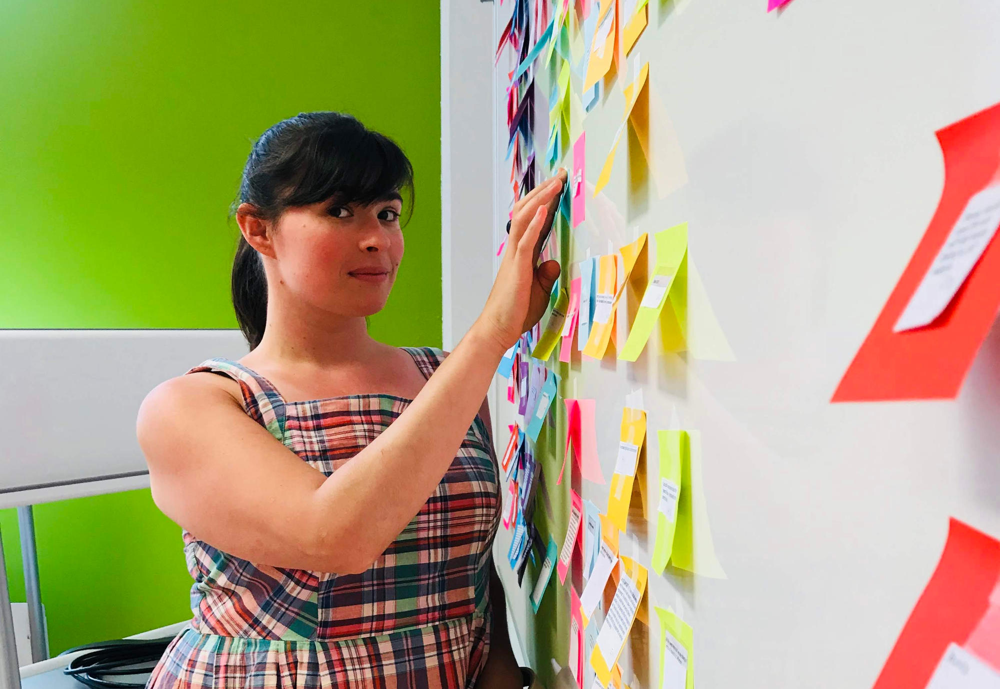
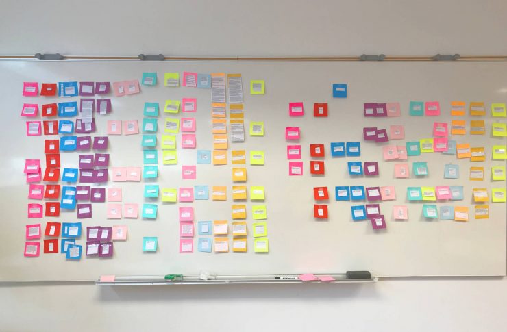
Their first steps to “building an even better mousetrap”: organize the thoughts and impressions from over 20 interviews with researchers across two campuses and other visitors to the website; spend hours learning how scientists and others use the site; then, videotape the researchers navigating the pages to identify what stood in the way of achieving their goal. After analyzing the footage, transcribing interviews, synthesizing data and identifying user patterns with sticky notes and other tools, the UX team begins to design a new framework of organization.
“You just have to pick on the right findings from the user feedback and sort it into categories,” Kuvalekar says. “That’s how you build a solid affinity map to support your recommendations.”
“There are lots of sorting techniques and methods we use,” Gurak adds. “But all UX-ers love Post-its.”
A Real-World Opportunity
The whole idea of engaging UX designers started in a meeting of the website workgroup for the Jefferson Committee on Research (JCOR). Although many agreed that the site contained useful information, they felt it needed to evolve based on a new set of research needs.
For researchers, site functionality, navigation and a place to display their discoveries are key to securing grant funding. Why? Because every laboratory functions a bit like a small business, linked to, but largely independent from, the parent university. The head of the lab—the principal investigator—keeps the lab funded with grant dollars, paying for the salaries of her workforce, the graduate students, postdocs and technicians through that same funding source. And these grants are extremely competitive, with only about 18 percent getting funded per year from the National Institutes of Health (NIH).
When Dr. Tim Mosca, a relatively new faculty member in the department of neuroscience at Jefferson, was putting together a grant application for his first major grant at Jefferson, he spent hours looking for information that would support his pitch to the NIH. A researcher proposing a new project has to demonstrate that he has the access to the equipment and expertise needed to carry out the work efficiently. In many fields, equipment costs alone run in the thousands of dollars, so access to shared facilities become crucial.
“If I’m a new investigator, I don’t have a 20-year reputation as a professor,” Dr. Mosca says. “The first thing a grant reviewer would do is Google my name. My profile page needs to be good. Then, she might also check to see if I really have the resources and core facilities I say I have in my application. Reviewers need to verify my claims and that’s usually done online, so having the right, enough or easily accessible information on a site is essential to winning an award that could support my lab for the next five years.”
As the conversation in the JCOR subcommitee progressed, Dr. Mosca’s colleague and fellow neuroscientist Dr. Richard Smeyne nudged him and said, “Don’t we have student computer programmers and web designers now who could take this on as a project and look at what we might need?”
JCOR’s chair, developmental biologist Dr. Sue Menko, who had first recognized the need for a Jefferson research website and advocated for its creation, reached out to colleagues at East Falls. She found a partner in Neil Harner, director of the user experience and interaction design program at Jefferson. The two agreed that this represented a real-world opportunity for students to work with researchers over the summer to analyze their changing needs and goals for the website, and make recommendations to help map out the site that could be later executed by designers and programmers.
A Rapidly Expanding Field
Understanding the “science” behind a seamless website experience, or an improved flow of passengers in a busy airport, is a relatively new field of study, at least in its current form. UX design for websites came out of the realization that the users and the builders could benefit from a translator who could speak both languages in order to appreciate and communicate the needs and constraints of each. Like other fields of study at Jefferson, UX is part science, part design thinking.
We never shy away from the crazy ideas. No ideas are thrown away on the first brainstorm.
—Ishita Ferdousi
As a field and career, UX is rapidly growing. About 4,000 new jobs are posted for UX designers per month, according to Emsi, a labor market analytics company. As organizations begin to understand the needs and expectations of viewers who go online or on mobile devices to shop, read, get healthy, find rides or quickly find the info they want, the demand for UX designers expands. According to one estimate, for every dollar a company spends on UX, it gets $100 in return.
Whether a website is easy to use on a mobile device can have an enormous impact on a company’s credibility. According to research from Google, 52 percent of users who had a bad experience on a mobile version of a website were less likely to engage with that company. And 79 percent said that if they couldn’t find something quickly on a mobile site, they’d go elsewhere, likely to a competitor.
“It’s an evolving field, and I can see changes in curriculum happening while I’ve been here,” says UX design student Ferdousi.
“A program has to be nimble and respond to changes in the market so we have the skillsets that are in demand when we graduate,” Seligsohn adds. “The chances to try our hand with real client problems prepares us in ways that classroom instruction alone doesn’t.”
UX design is a discipline that combines strong skills in empathy together with rigorous analysis and synthesis of information, Seligsohn says. It’s not just about being a great designer, nor a great programmer. It’s walking a line between the two. Students learn computer languages like HTML, CSS and Javascript to accurately convey the vision of the client, as well as the limitations of the code or platform.
New Order
Part of the strength of these four UX design students comes from their diverse background of experiences and careers. One was a lead singer in a band, two majored in architecture, one worked in graphic design, jewelry making and other areas.
“In some ways, we’ve all had jobs that orbit around the user,” Gurak says.
These experiences give a flexibility of thought and openness to new ideas, Ferdousi says. “We never shy away from the crazy ideas. No ideas are thrown away on the first brainstorm.”
As they pulled together multiple rounds of feedback from many types of researchers and assembled design ideas, the future shape of the research website became clearer. The students make the case for an organization that separates the needs of researchers on campus from visitors seeking to learn more about Jefferson’s work in general—the audiences that might represent prospective faculty, collaborators and grant reviewers. Their new proposed site map organizes pages by most-requested topic and suggests sections to capture the newer research disciplines and areas.
“The students’ work was immensely useful in helping start the conversation on how this researcher website needs to evolve,” says Christian Small, associate vice president for interactive marketing. “As we revisit many of the questions the students posed to our researchers, our site design is slowly coming into focus in a way that represents the organization’s priorities.”
Will it become a seamless experience? Will researchers and science-curious visitors be able to easily discover what’s great about Jefferson’s inquiry? “As with any project with a similar scope, it’s now up to the client to decide how best to use UX recommendations and apply them,” Harner says.
Republished from https://nexus.jefferson.edu/science-and-technology/ux-design-every-great-design-begins-with-research/.
Article by Edyta Zielinska.




Add comment