Written by Emma Prushan, VCD, ’25
During their spring semester, juniors in the Visual Communication Design program take Advanced Branding, a course which focuses on a system-based approach to branding and identity. Students conceptualize and strategize multi-touchpoint brand systems for two major projects: an educational entity and an event.
For the event branding experience project, students conceptualized, branded, and designed materials for a festival of their choosing that supported a cause or mission through both physical and virtual programming. Because event branding is largely experiential, this project required students to create a brand system that could be flexible across time, space, and medium, while engaging the audience and creating a memorable experience. The students’ festival branding was required to include five touchpoints that support the mission or cause behind their festival: an online presence (website or app), a printed piece (a brochure, promotional posters, etc.), a physical environmental component (signage, environmental graphics, etc.), and two other design components of their choosing to advance the festival experience (packaging, social media, animation, etc.)
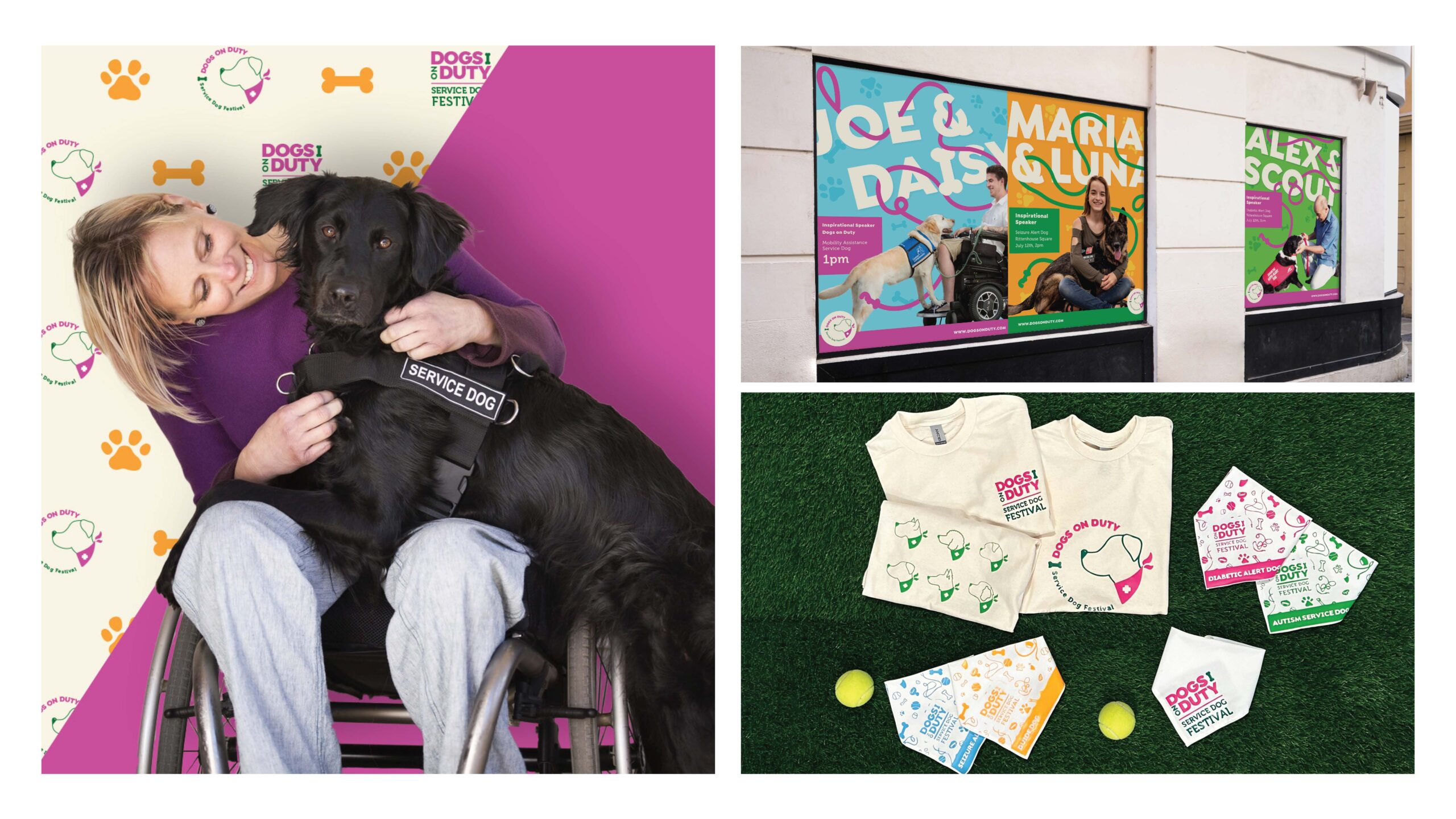
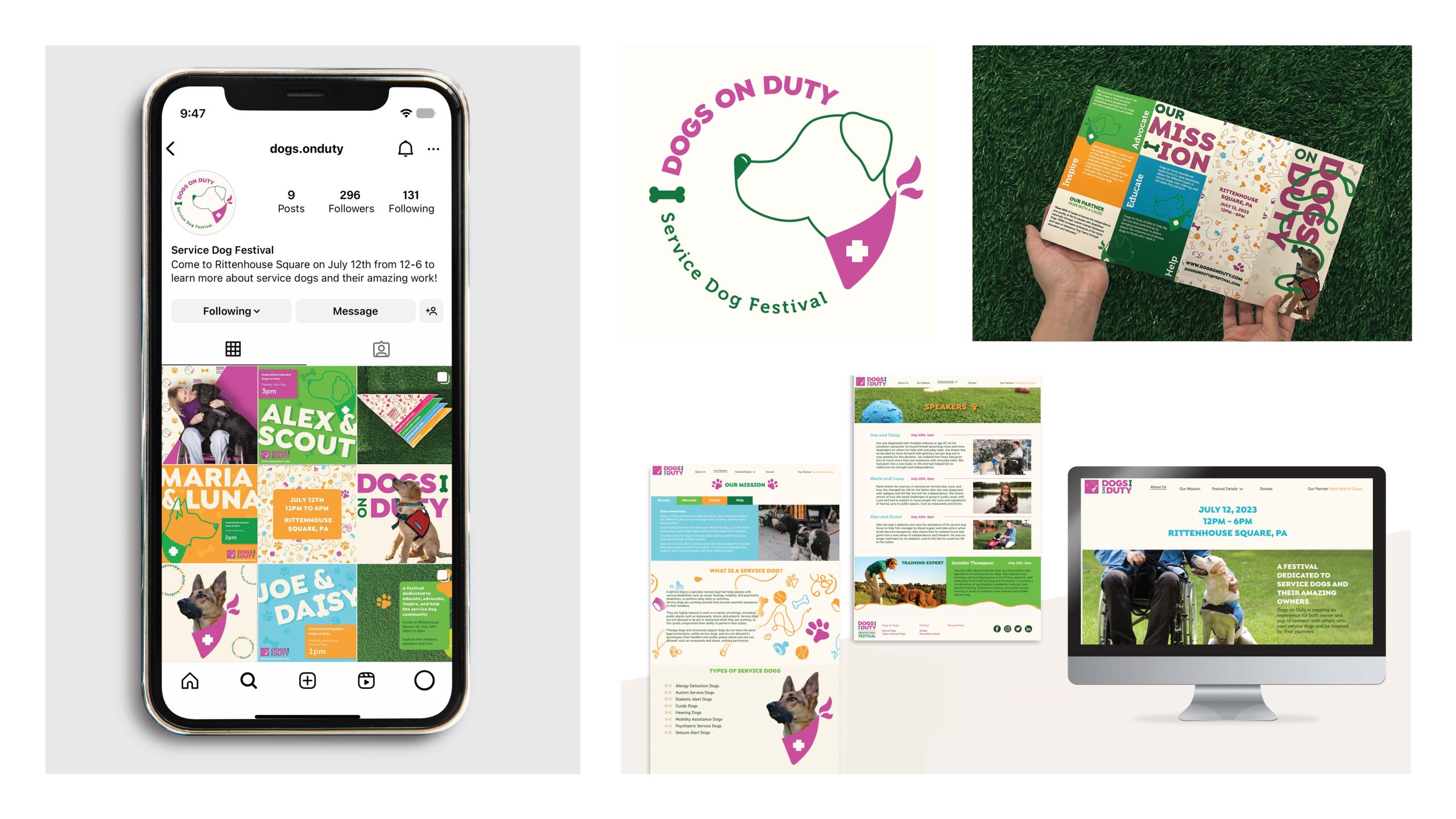
Erika Sheehan ‘24 – Dogs on Duty: A Service Dog Festival
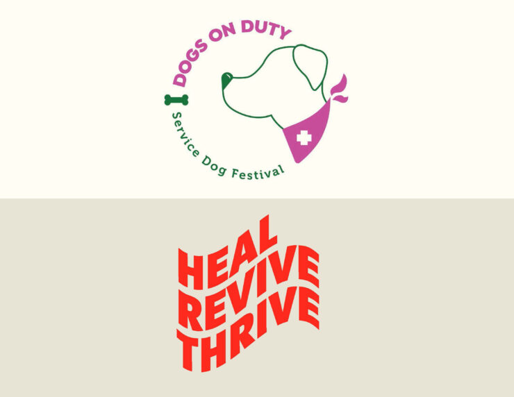
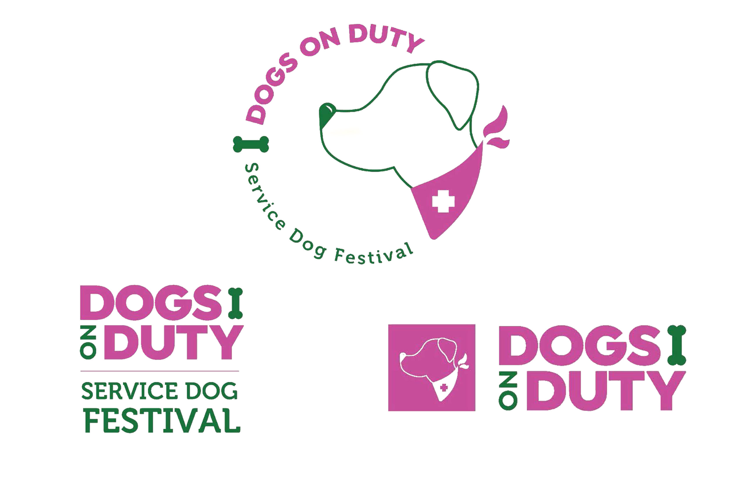
Erika Sheehan (Visual Communications Design ‘24) created Dogs on Duty: A Service Dog Festival, which is dedicated to educating, advocating, inspiring, and helping the service dog community. The festival’s audience also extends to those interested in the process of training a service dog to be placed with an owner and change their lives for the better. Dogs on Duty seeks to combat the expenses of training and reduce confusion in the process of acquiring a service dog. Festival goers will leave the Dogs on Duty event inspired by the journeys of the festival’s speakers and the amazing work of service dogs.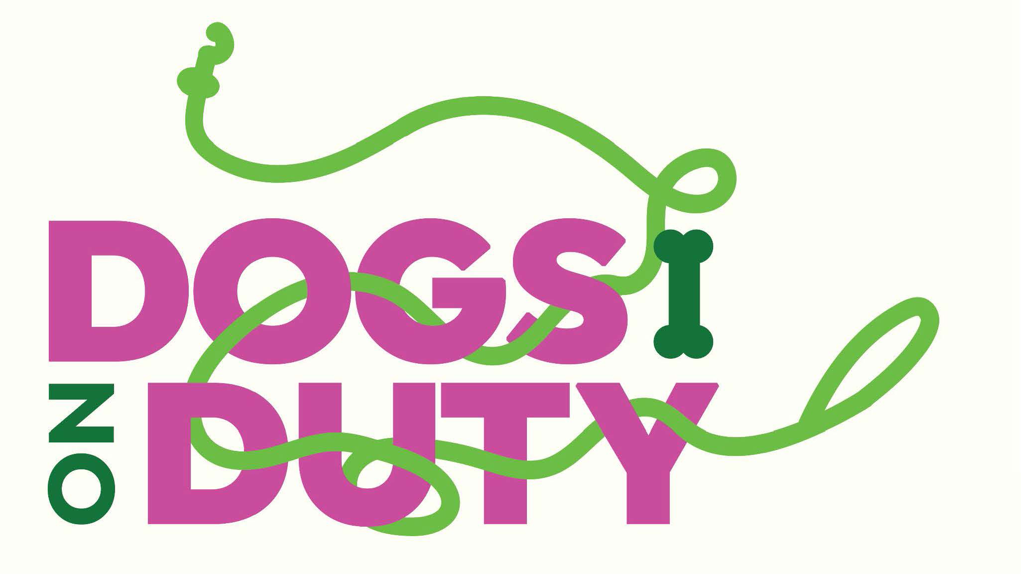
Samantha Barkholz ‘ 24 – Heal Revive Thrive Fest
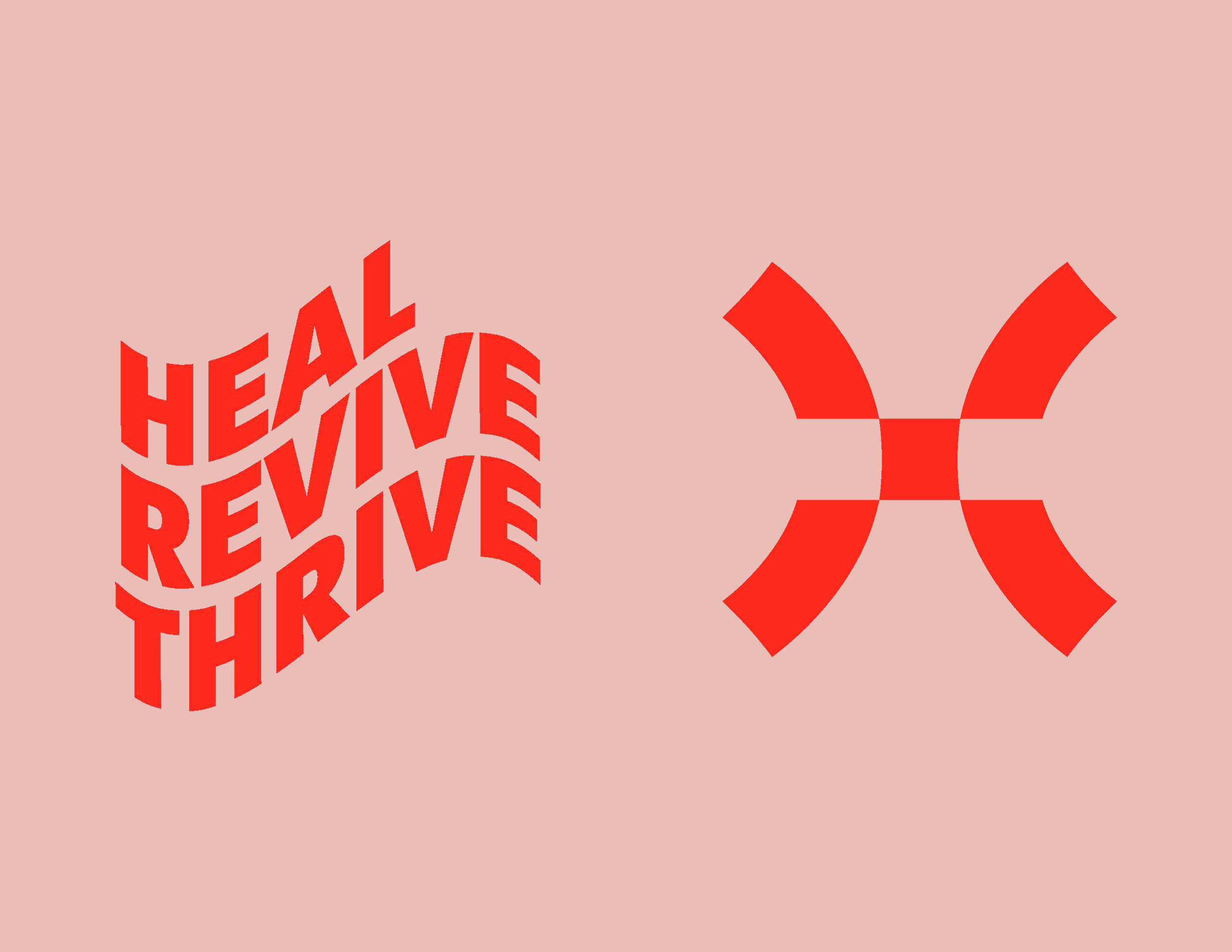
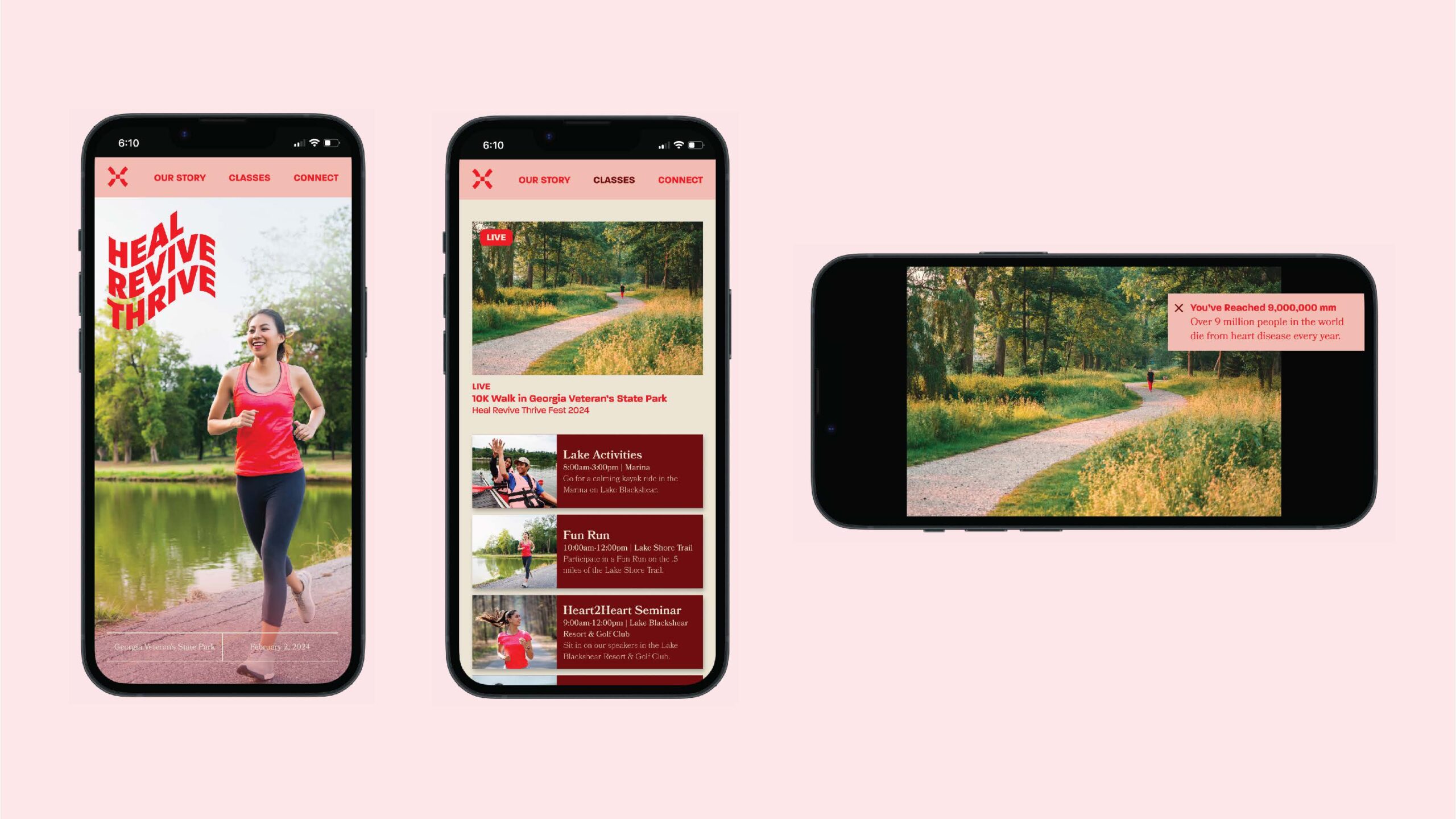
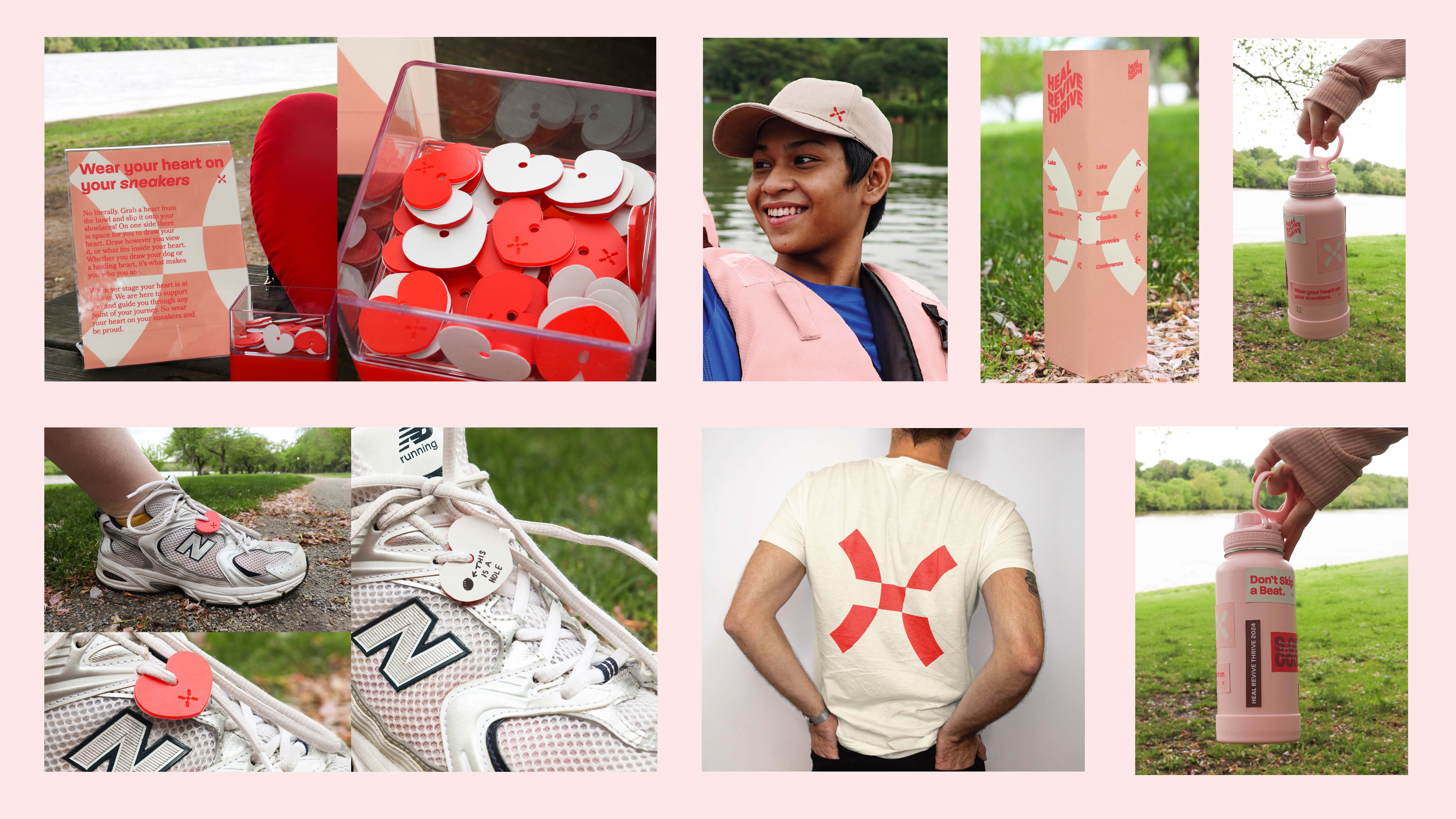
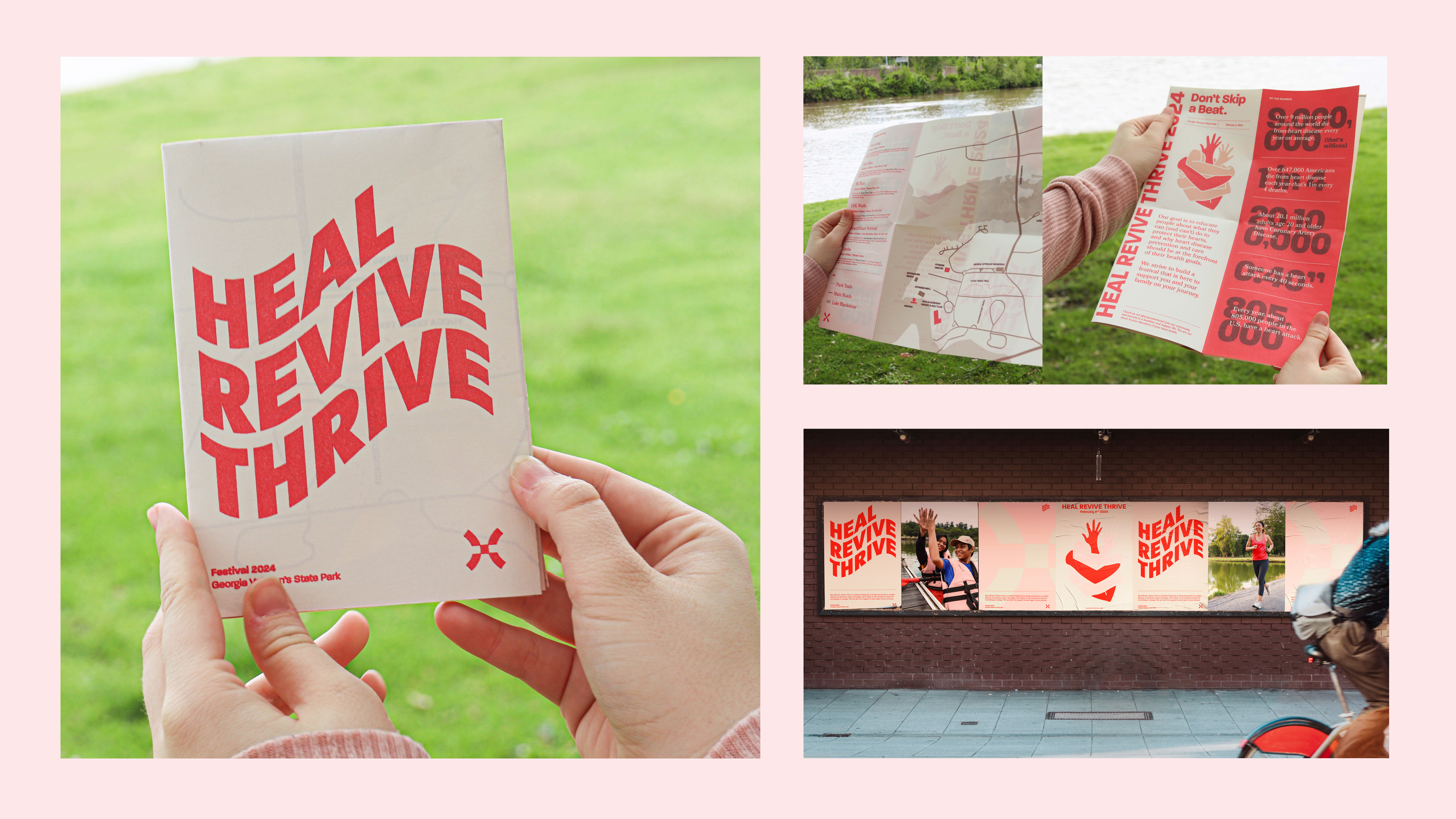
Cardiac awareness has played an important role in the life of Samantha Barkholz (Visual Communications Design ‘24) and her family. Her passion about this topic inspired her to create Heal Revive Thrive Fest to bring awareness and offer support to cardiac disease of all forms and stages, while also encouraging an active lifestyle. Barkholz’s design system is deeply connected to the strength, support, and flowing aspects of the heart and cardiac awareness. The festival’s color palette includes bright red to capture viewers’ attention and create an upbeat energy. The most crucial meaning behind Heal Revive Thrive’s logo is that it depicts a diagram of blood flow in the heart, from the veins through the valves (the heart’s openings) and to the eateries and aorta.
